Public
screen_v5_3d
NOP 2nd floor / custom furniture
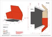
In order to get the most out of the attic's rather problematic spaces for the intended office use, it was decided to equip the 2nd floor of the palace with custom furniture.
The design of the furniture mainly dealt with two issues:
- many of the small rooms suffered from geometric constraints (roof slopes, pillars) that required special solutions
- parts of the attic had been converted to open-plan offices that were met with reservations by the staff
NOP 2nd floor / west wing
The building's south-west wing had its attic already converted to usable space during post-war reconstruction, but consisted of small rooms, some evoking rather claustrophobic feelings.
While taking the needs of the department to be accommodated into account, the proposal sought to bring out the spacial qualities of the roof by removing unnecessary partitions and suspended ceilings, giving the rooms maximum volume. This was welcomed by the investor, but met with reservations by some of the users, so that in the biggest room (A2-1), we finally settled for a central division.
NOP 2nd floor / east wing
The east wing of the attic had already been converted to office use in the 1990's, but consisted mostly of problematic rooms with insufficient height or fenestration.
I proposed the creation of a central space to serve as break area for the whole floor, an idea that was accepted even though it required a substantial rework of the HVAC planning in the tight time frame.
NOP 2nd floor / central area
The central area of the second floor consisted of small, rather unattractive individual offices along the north and south facades and a large, poorly lit circulation space in between.
While the investor's initial planning foresaw the insertion of another closed volume (to be used for meetings) into this already quite sombre area, I convinced user and investor to remove all existing partitions, and to create an open-plan office space around a freestanding, partially glazed meeting room.
The scheme also introduced new toilets and wall openings to bring daylight into the main staircase.


